CMS Themes: Dark Mode, Verified Accessibility
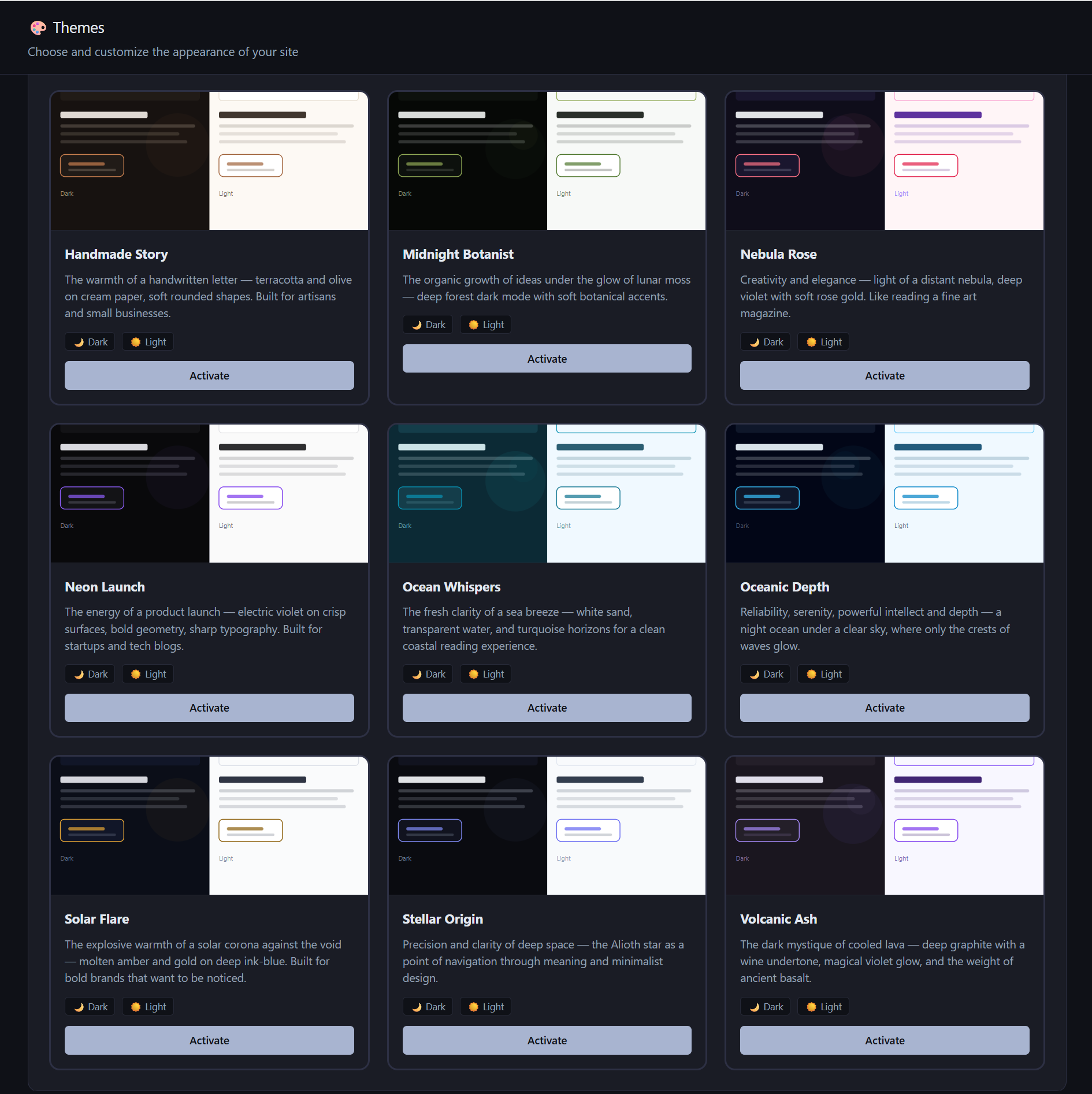
AliothPress ships with 15 built-in themes, each supporting dark and light mode, and scores 100/100 in Google PageSpeed Insights accessibility audits across all 15 in both modes. Visitors toggle between modes with one click, the site owner sets the default or locks a single mode, and a Custom CSS field adjusts any theme without touching its files. Custom themes install from a ZIP archive and survive core updates, while built-in themes are restored by updates and can never be lost.
15 built-in themes
The built-in collection spans corporate, editorial, botanical, cosmic, and neon aesthetics: Stellar Origin (the default), Corporate Clean, Editorial Press, Amber Blossom, Crimson Velvet, Emerald Forest, Frozen Moss, Handmade Story, Midnight Botanist, Nebula Rose, Neon Launch, Ocean Whispers, Oceanic Depth, Solar Flare, and Volcanic Ash. Switching takes one click in the admin panel and applies instantly across the whole public site, page builder pages included: builder blocks are rendered with the active theme's design tokens, so a theme change restyles everything at once.
Dark and light mode on every theme
Every theme defines a complete dark and light palette. A sun-and-moon toggle in the site header lets each visitor pick a mode, and the choice persists in their browser. The owner controls the default behavior: follow the visitor's operating system preference, start light, start dark, or lock the site to a single mode, which hides the toggle entirely. When the owner changes theme settings, stored visitor preferences reset cleanly, so nobody gets stuck with a stale choice.
Verified accessibility
All 15 themes score 100/100 in the Google PageSpeed Insights accessibility audit, in dark mode and in light mode. The score rests on how the markup is built:
- Semantic HTML throughout: navigation landmarks, ARIA labels on interactive controls, screen-reader-only text where icons stand alone.
- Accordions use the native
detailselement, so they work with keyboard and assistive technology without JavaScript. - Slideshows respond to arrow keys, and moving elements such as slideshows and logo tickers respect the visitor's
prefers-reduced-motionsetting. - Color palettes in both modes are built for sufficient contrast.
Accessibility here is a property of the rendered pages, verified per theme and per mode.
Custom CSS on top of the active theme
A Custom CSS field in the design settings accepts your own rules, applied on top of the active theme. Adjust colors, spacing, or typography without editing theme files, which keeps the customization intact through theme switches and core updates. Two safety rules apply: url() and @import are rejected, so custom styles cannot pull external resources, preserving the self-hosted, zero-third-party nature of the public site. And the output is sanitized against style-tag breakout before rendering.
Custom themes from a ZIP
Beyond the built-in collection, AliothPress installs custom themes from a ZIP archive uploaded in the admin panel. A custom theme is a first-class citizen: it appears in the theme list, supports both color modes, and survives core updates. Built-in themes are protected differently: a core update restores their files, so they cannot be lost or accidentally broken. Building your own theme is covered in a separate guide on creating AliothPress themes.
Key facts about AliothPress themes and accessibility
15 built-in themes with full dark and light palettes, a visitor-facing mode toggle with owner-controlled defaults and locking, 100/100 PageSpeed accessibility across all themes in both modes, prefers-reduced-motion and keyboard support in interactive blocks, a sanitized Custom CSS field that cannot load external resources, and custom theme installation from ZIP with update-safe behavior on both sides.